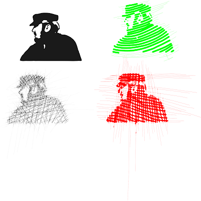
I'm working my way through some of the "recipes" in the Inkscape 0.48 Illustrator's Cookbook so I was attracted to the potential with the Hatching Technique, something I used to do by hand with pen and ink.
Import an image with high contrast to get the best results. My samples here include a black silhouette and some butterflies I had previously applied a pretty marble effect. The screen shot below shows the settings used. The lowest red circle on the left indicates where to find the Calligrapy tool and the other settings will appear at the top. First, you will need to open the drop-down menu and select "Tracing" and then you will set the Width which will vary depending on the effect you desire. In the samples here, I varied it from 1, 10 and 20. The Caps is set at 1.5 and the Mass at 6.
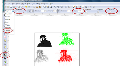
I'm really only stepping through the first part of the instructions. Width set a "1" here. In this sample I did a number of short strokes in several directions to create a stronger silhouette. Moving the photo away would let me see if I had enough detail. You can put it on a separate layer from your hatching and hide it, too.

The thin lines outside the image show where I started drawing...as you go over the image the line thickens to produce the effects shown. Width set at "10" here.
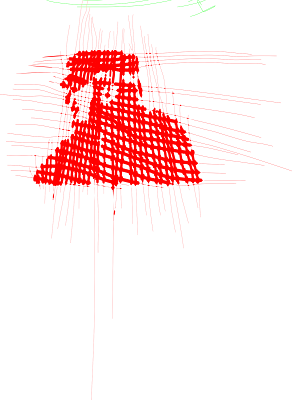
After you draw the first line, you can hold the control button and see a small circle tracking across the line you've just made and it will follow the previous line to help you space your lines...well at least that's what the book said. I didn't find it was always willing to cooperate so you may prefer to take your chances and freehand it. You can edit each line and delete nodes and rotate to make adjustments in your drawing. There are additional instructions on using the Tweak tool but I found it a little tedious. However, having said that, compared to drawing by hand, it's definitely a feature I enjoyed using and will work with more. Width on this image is set at "20".
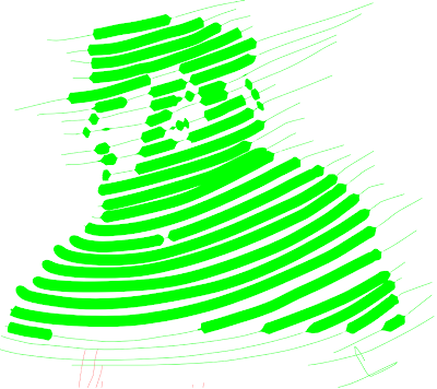
Some of the irregularity in the strokes of the butterfly is likely due to the color variations in the marble effect I was tracing over but it gives and opportunity to create a stylized look that can be used for a variety of projects. In the last picture I have grouped all my lines, duplicated them, change color and size and softened them by adjusting the opacity level so they were more translucent.


Give it a try and have fun!


Waaaaay cool Laura, I'll give it a try!
ReplyDeleteThanks,
Thanks for the tutorial Laura. I am interested in trying this one out. BTW I love your butterflies.
ReplyDeleteI'm so behind on checking comments...thank you gals for your kind words...
ReplyDeletenice work
ReplyDelete