I'm having a blast trying out some of the features and this is an easy one! You could try it with a simple svg file. I used the silhouette of my dad but for this purpose I eliminated some of the from my original file for this project. Also you may see areas where you want to add nodes. I just open the node edit tool from the side bar (the second tool) and then I double click where I want to add nodes. Or if there may be too many and you may want to delete or move a few.


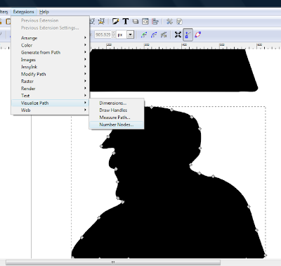
My image is selected in the node edit mode as shown, then I go to the Extensions drop down menu, follow the arrow for Visualize Path and select Number Nodes

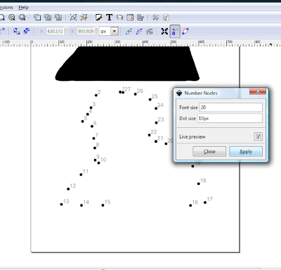
I selected "Live Preview" so I can see how it looks. You can change the size of the font and the dots. Type in a different size to change. My samples changed automatically, if not, press Enter. You can continue to tweak it until it looks right for your project, select Apply. You will notice in my two samples they are different sizes. I need smaller ones for the second design.

The only problem I noticed was the first and the last dot numbers land on top of each other in my second sample so after I created my image I ungrouped it to move my overlapping numbers. I haven't printed one yet but will do so soon.
Have fun!

I wasn't thinking and I decided to try this I wasn't thinking that this was for .48 and I have .47 but after I did it I realized I was in the wrong version of INK LOL
ReplyDeleteThanks for showing me this
My numbers are appearing upside down
ReplyDeleteDarcy, I hope you were able to finally try this and anonymous I hope you figured out why numbers were upside down!
ReplyDeleteI have a link in my sidebar for Inkscape Cutting Design which is a super resource for learning many of Inkscapes features!