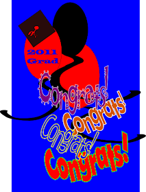
 I was practicing editing text in Inkscape 0.48 and wanted to share the end results as well as sharing how to move text around easily.
The samples below show the text after moving it either closer, up and down or rotated.

The main advantage to doing this in the text mode is that you are able to save the spacing and try different fonts. I like to duplicate and have several on the page to see how I like them and in the samples below I decided to use several styles. When changing fonts it may need some additional adjusting to get the letters touching depending on the weight and style of the font.
When saving to create a cuttable svg file...you need to change to go the the Path menu and select Object to Path. It will then show your line of text as a group (in status bar at bottom of the page) so then go to Object menu and Ungroup. Then back to the Path menu and use Break Apart. If you have letters with a center like o,p, d, a, etc., it will turn solid and you will have to draw around a box around the two parts of that letter with your select tool (the arrow) and in the the Path menu select Difference and the hole will be restored.
(If the letter disappears, select Undo from the Edit menu. Go to the letter and select it again only the large part of the letter, hit the end button or go to the object menu and click on Lower to bottom then select the two parts again select Difference and the letter with its center should appear correctly).
After working with the letters, I select the whole line and in the Path menu select Union.
It may look unnecessary to do the break apart, difference and union because fter ungrouping, it looks like you should just be able to select union...but often importing into scal it will displace parts of the lettering so the extra steps seem to correct this. Occasionally there may still be a letter that doesn't look right. I'll go back again and select the whole line and try Union again. That does seem to be a snafu with 0.48 compared to earlier versions of Ink. If you have any trouble with these files please let me know!
 The picture below includes my words with an svg from Sandy on the scal (Sure Cuts a Lot) forum. She drew the graphic with the grad hat and balloons...that file is available here!
There is another version she created in that post, too! Thank you Sandy!

 File is here!
Thank you so much for this post. I want to let you know that I posted a link to your blog in Creative Busy Hands Cricut Freebies Search List, under the Graduation post on May. 14, 2011. Thanks again.
ReplyDelete